
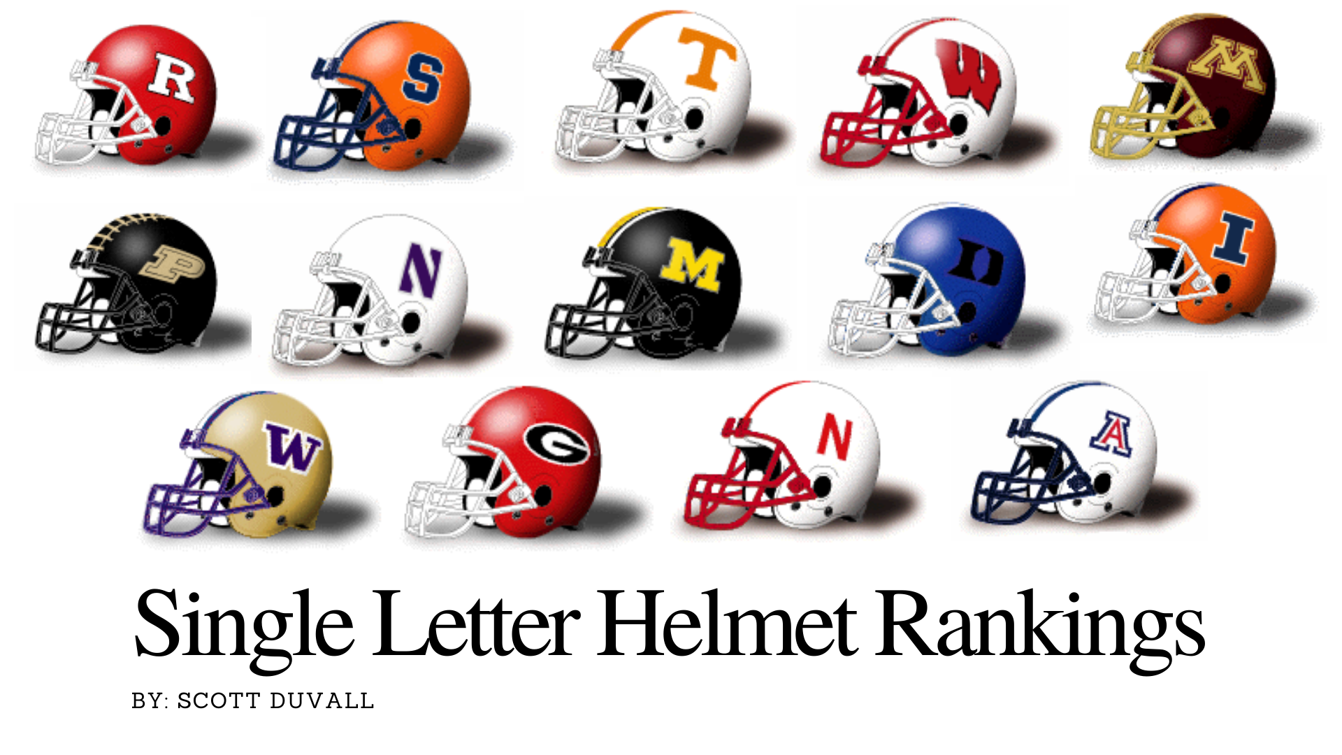
The Ultimate Ranking of Single Letter College Football Helmets
By Scott Duvall | @JawaviFilms
Watching the first college football game of the 2021 season this past weekend I was taken aback. No, it wasn’t the hard-to-watch Nebraska offense, or the fact that Illinois scored it’s first points of the season with a rare safety. It was the classic matchup of single letter helmets worn by the Cornhuskers and Illini.
If you’ve ever listened to our podcast or if you follow me on Twitter, you’ll know that one of my most passionate topics to discuss is uniforms - college or pro, it does not matter to me. I’m not a fashion merchandising major (my wife is) but I love the culture of people online and social media who discuss, critique, debate and celebrate the nuances of college football uniforms, alternate jerseys and how they’re put together on the field to promote the school’s brand.
So, in honor of the start of the 2021 season and to recognize all schools who keep it simple and traditional, here is a ranking of the Power 5 schools with the Best Single Letter Helmets in all of college football.
Rules:
Helmets can only contain one letter on both sides. Sorry West Virginia.
Shading or borders around the single letter is fine. Congrats Arizona.
A single letter helmet MUST be the school’s current/primary helmet. Sorry Kentucky.
Helmets with a “U” around or near the letter is not allowed. Sorry Auburn.
No logos or designs can be in or around the single letter. Sorry South Carolina and Stanford.
Only Power 5 schools are included on this list. Sorry Marshall.
Independents won’t be included. Sorry BYU (Yours is hard to classify anyway).
You’ve read my rules for grading for these helmets; hopefully there is no confusion. Out of the current Power 5 conferences, I’ve found only 14 college football teams meet this stringent methodology to qualify. On with the list.
Single Letter College Football Helmets Ranked

14: Northwestern
Northwestern is that team who every few years surprises the Big Ten and wins their side of the division. They’ve been to the Big Ten Championship game twice in the past three years. And most people wouldn’t know what their division is called. I just looked it up, but will forget by mid-season. But the “N” on the helmet look is fine. They’re last in the single letter college football helmet rankings, but still made it because they meet the criteria. More often than not, Northwestern will show up and play games wearing a helmet bearing an “N”. The helmet color and color of the “N” changes often. If you’re looking for an opinion on what the best helmet option is for the Wildcats - it’s this white lid with purple accents. That’s the best look.

13: Purdue
Careful Purdue. The fact that there are train tracks from front to back on the helmet is more than a little bit off putting. Purdue feels like the Vanderbilt of the Big Ten confernce. Not only are the color schemes almost identical, but Vandy and the Boilermakers played against each other in 2019. Congrats Purdue, y’all won that matchup of Big Ten vs SEC. On the plus side, the black and gold color combination is a good one and they’ve been predominantly positioning the “P” on their helmet since the 1970s and that kind of uniform consistency is admirable.

12: Rutgers
Rutgers has been rocking an “R” on the side of their helmet for the better part of ten years. Before that it seemed that the administration wanted to make sure that everyone knew the Scarlett Knights were located in New Jersey. From 1985 to around 1995, the helmet had “NJ Rutgers” spelled out for all to see (and make note of). Now that we have the internet, no one needs location data embedded on a football helmet, so the block “R” is a strong, solid approach.

11: Missouri
As a fan of the traditional SEC, I’m no fan of Missouri being in the conference. As a Georgia fan, I’m fine that the Dawgs get to play Missouri every year. It’s an almost guaranteed victory in the grueling SEC schedule. Missouri, (or is it Mizzou) has a great looking helmet when they wear the block “M”. The Tigers often mess around with multiple uniform and helmet combinations, so you never know which look you’re going to get when tuning them in on tv. But with this black helmet, yellow “M” look as their designated traditional helmet you’re getting a nothing-to-complain about design. They should actually be ranked higher, but the fact that there are literally over 24 different helmet designs worn in the past ten years, 11th is where they’ll stay.

10: Duke
Thing about Duke basketball - classic, understated uniforms. That’s not how Duke rolls with football. The Blue Devils are one of those teams that might change their helmet, or might not from year-to-year. Since the 1960s there have been around 11 different decals, logos, or lettering on Duke’s football helmets. They spell it out, they put different variations of devils that are blue on the side of their helmet and have even gone with numbers like Alabama traditionally wears. All in all, this is a solid look and carries a bit more coolness to it than the script “Duke”, which they’ll probably go back to sometime soon.

9: Minnesota
Row the Boat Minnesota. This helmet is not great. There are oars on the helmet, which has nothing to do with all of the lakes in the state of Minnesota, but rather it’s head coach, PJ Fleck’s own saying. A motivational phrase that he used to say at Central Michigan and now says at Minnesota. Look, I love motivational quotes, coaches, and mentors, but it’s a little bit much when you integrate a relatively new coach’s catch phrase into a helmet design on a team that’s been playing football since 1882. I’m not a fan of their gold rendition of this helmet, which will surely be trotted out at some point this season. But it is a single blocked “M” so it counts for this list.

8: Wisconsin
The wide-stretched, almost italicized “W” is an okay look. There’s just something about Wisconsin’s uniform that has always bothered me. Perhaps its the fact that the “W” looks like it was created by someone who got a little too aggressive with the stylized and perspective features in Photoshop? Or, maybe it’s because there is no uniformity in the “W” - they must have left “W” and right “W” in the equipment room, but I digress. Its number 8 - middle of the road on this list for a reason. But look out traditionalists. Later this season, Wisconsin could jeopardize being on this esteemed list. They’ll be adding an overlay of the word “Forward” on their helmets when they play Notre Dame at Soldier Field this season.

7: Syracuse
From sporting a plain orange helmet for oh so many years to adding the “S” back on the side, Syracuse went from showcasing the ugliest color ever (orange) with nothing to break up the orange juice colored dome to having a simple decal. It works! It looks like the block “S” was reintroduced to the helmet back in 2012. The ‘Cuse has a storied list of famous players. But Jim Brown, Ernie Davis, Donovan McNabb, and even Dwight Freeney never played with the current look of the helmet. Considering the Orange’s struggle in recent history, might it be time to ditch the “S” and go back to numbers or nothing?

6: Washington
My son’s name is Walker. He loves any team with a “W” front and center as their logo. No other team’s “W” has captured his heart more so than the University of Washington. The Huskies purple “W” on gold helmets looks stunning - always has. Sure, you never know when they might slap that Dubya on a black, purple, white, or metallic helmet shell but things are looking up in Seattle. Like many other schools in the 2020s, the Huskies seem to be gravitating more towards a traditional look. Do a Google image search for Washington Huskies - 95% of what you’ll see are the gold helmet/purple “W” combo. Give them credit where credit is due, since 1975, they’ve been sporting the wide “W” on their helmets. Oh, and watch out! Washington might just up and win the Pac 12 this year.

5: Arizona
Welcome back Arizona. I say welcome back not because they only played five games last year and managed to go 0-5. But welcome back to an awesome helmet. For so long the Wildcats toyed around with metallic blue and red helmets. It still had their classic blocked “A” but it was frustrating to see a team fail to understand that one of the nation’s best uniform looks was right there - waiting to be resurrected. Lucky for us fans, new head coach Jedd Fisch understands tradition. It sure will be nice to see that red letter “A” trimmed in navy blue on a white helmet this season. That Desert Swarm uniform and helmet combo is a definite top 5 look.

4: Illinois
Part of the inspiration for this entire post is partly because of my friend and podcast co-host Will Leitch. He’s a proud University of Illinois alum and on occasion wears gear with that powerful big block “I” on his chest to our podcast recordings. The Illinois helmet was in the news this week in a piece by Mike Pearson of FightingIllini.com with quotes from new head coach, Bret Bielema talking about tradition and how he has added a few of his own changes to this year’s helmet. Bielema said, “I love the Block I, so that made us go to the Block I with the white trim.” Nice call coach! It’s big. It’s bold. And I love this classic look!

3: Georgia
So my Bulldogs finish 3rd in my own rankings. To be fair the Dawgs haven’t finished number one in forty-one years - so I’m told. Nevertheless, UGA fans and coaches have historically been ultra conservative with uniform changes. That’s probably due to a couple of awful helmet mistakes in the past ten years. But dabbling in uniform changes for UGA are (mostly) fine. Give me more black jerseys. More red pants. Bring back the true silver britches, but DON’T mess with the red helmet. Georgia’s power “G” helmet is so recognizable with the UGA brand it should forever be labeled untouchable. It’s such a good look in fact that an NFL team uses the same logo.

2: Tennessee
The Vols might be terrible at football and have awful school colors, but that blocked “T” is a nice look. I have nothing else positive to say about Tennessee, so I’ll stop there.

1: NEBRASKA
It’s been 21 years since the Huskers were #1 in anything football related. In fact, Scott Frost might be out of a job sooner than later, but the classic Nebraska uniform doesn’t ever change. As a 45 year old guy I vividly remember the dominant Tom Osborne teams of the 80s and 90s. In fact, there’s part of me that still feels like it’s a big deal when I tune into a Nebraska game, even though it’s not. But no one can argue with how good that skinny red capital “N” looks on that white helmet. The brand style is on solid ground despite the continued poor play on the field. The all white uniform with red trim combined with that beautiful and oh so basic helmet will forever make me think of the Huskers of Scott Frost as a player, not a head coach.
And there you have it. Do you agree? How would you rank these helmets and do you have a quibble with any team not on this list? Stanford and South Carolina were both close to making it, but the tree silhouette for the Cardinal and chicken for the Gamecocks muddy up the overall look, don’t you think?
Scott Duvall is an Athens, Georgia based filmmaker and photographer. He contributes to and produces the long-running Waitin’ Since Last Saturday podcast - A Georgia football themed show. Follow Scott on Twitter or Instagram. You can check out his website store here and buy some Georgia football prints.